Website
Damage
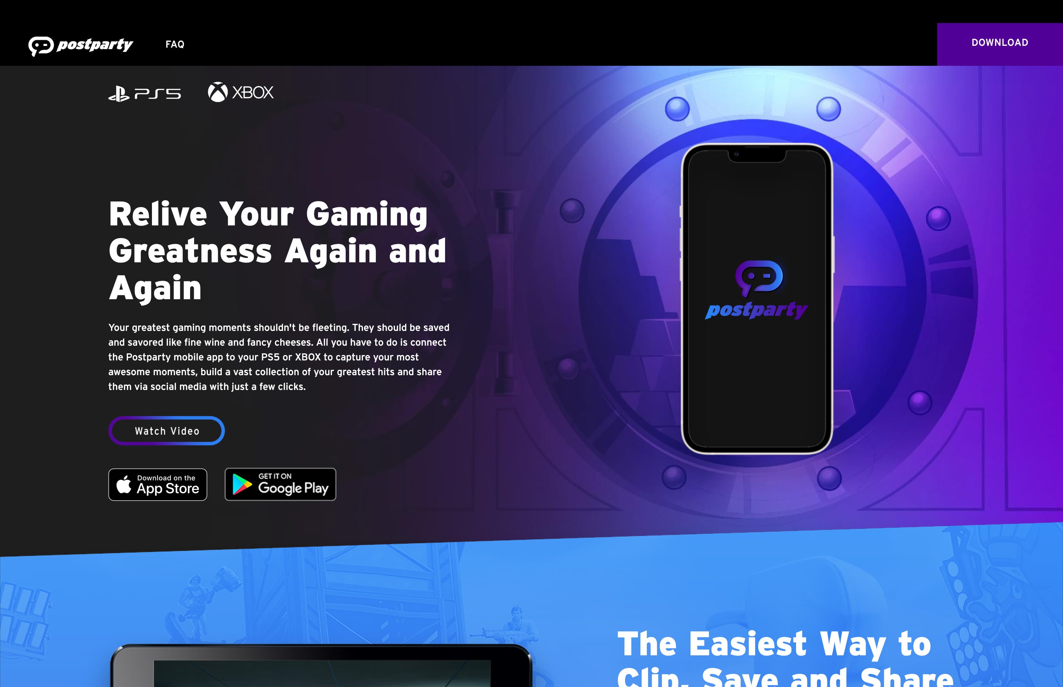
Promotion for Postparty app launch.
View live site (opens in a new tab)
The work
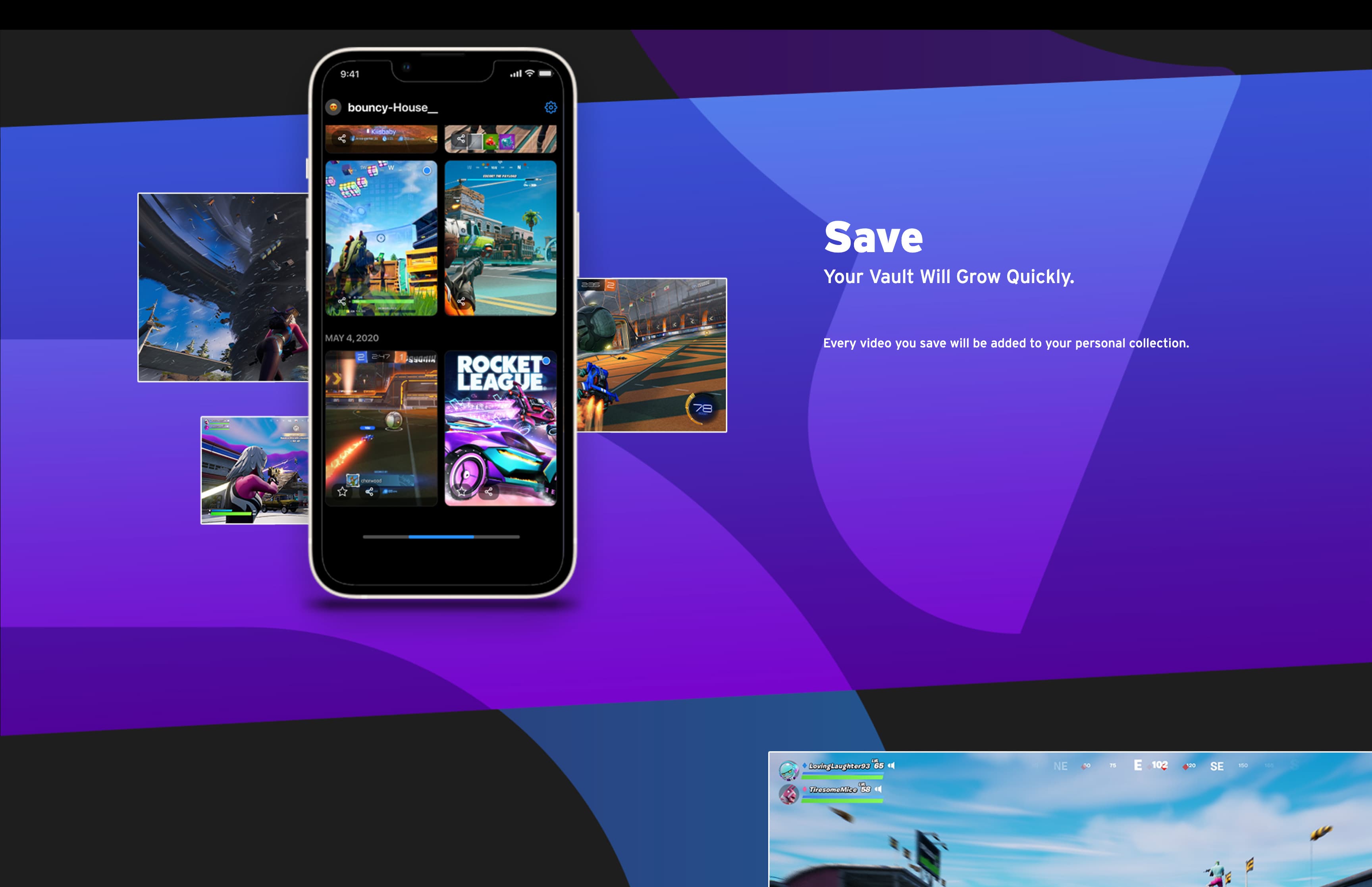
Front end build in React from the design files. I taught myself Tailwind for the project and added custom CSS where it needed more. Getting the layout to hold across device sizes was the hardest part. I tuned element sizes and positions at each breakpoint by hand to stay true to the design. The animation was my own addition, built with CSS and Framer Motion, and was not part of the design.
What I built
- React front end built closely to the design files
- Tailwind plus custom CSS, held consistent across device sizes
- A floating phone device and scroll-into-view cards, added on my own
Tools
React · Tailwind · CSS · Framer Motion
In motion